6 Important Rules in Website Design
When it comes to your website, extra attention should be paid to every minute detail to make sure it performs optimally to serve its purpose. Here are six important rules of thumb to observe to make sure your website performs well.
1) Do not use splash pages
Splash pages are the first pages you see when you arrive at a website. They normally have a very beautiful image with words like “welcome” or “click here to enter”. In fact, they are just that — pretty vases with no real purpose. Do not let your visitors have a reason to click on the “back” button! Give them the value of your site up front without the splash page.
2) Do not use excessive banner advertisements
Even the least net savvy people have trained themselves to ignore banner advertisements so you will be wasting valuable website real estate. Instead, provide more valuable content and weave relevant affiliate links into your content, and let your visitors feel that they want to buy instead of being pushed to buy.
3) Have a simple and clear navigation
You have to provide a simple and very straightforward navigation menu so that even a young child will know how to use it. Stay away from complicated Flash based menus or multi-tiered drop down menus. If your visitors don’t know how to navigate, they will leave your site.

4) Have a clear indication of where the user is
When visitors are deeply engrossed in browsing your site, you will want to make sure they know which part of the site they are in at that moment. That way, they will be able to browse relevant information or navigate to any section of the site easily. Don’t confuse your visitors because confusion means “abandon ship”!
5) Avoid using audio on your site
If your visitor is going to stay a long time at your site, reading your content, you will want to make sure they’re not annoyed by some audio looping on and on on your website. If you insist on adding audio, make sure they have some control over it — volume or muting controls would work fine.
6) Appropriate Spacing
There are three key areas of spacing:
- line spacing
- padding
- white space
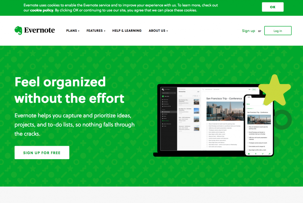
When design your website, keep these three key areas of spacing in mind. Here are couple sites that has plenty space, appropriate line spacing and comfortable padding around images and text blocks.
- Evernote

- Chicago tribune


